Cómo - Voltear una imagen
Aprende a voltear una imagen (agregar un efecto de espejo) con CSS.
Mueve el mouse sobre la imagen:
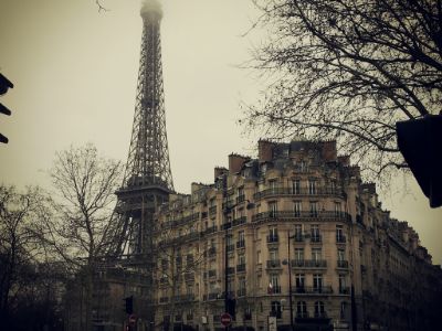
Cómo voltear una imagen
Ejemplo
<style>
img:hover {
-webkit-transform: scaleX(-1);
transform: scaleX(-1);
}
</style>
<img src="paris.jpg"
alt="Paris">
Nota: este ejemplo no funciona en tabletas o teléfonos móviles.
Sugerencia: vaya a nuestro tutorial de transformaciones 3D de CSS para obtener más información sobre las transformaciones 3D.
Voltear imagen 3D con texto
Aprende a hacer un giro 3D animado de una imagen con texto:
París
que ciudad tan increible
Paso 1) Agregar HTML:
Ejemplo
<div class="flip-box">
<div class="flip-box-inner">
<div class="flip-box-front">
<img src="img_paris.jpg"
alt="Paris" style="width:300px;height:200px">
</div>
<div
class="flip-box-back">
<h2>Paris</h2>
<p>What an amazing city</p>
</div>
</div>
</div>
Paso 2) Agregar CSS:
Ejemplo
/* The flip box container - set the width and height to whatever you want. We
have added the border property to demonstrate that the flip itself goes out of
the box on hover (remove perspective if you don't want the 3D effect */
.flip-box {
background-color: transparent;
width: 300px;
height: 200px;
border: 1px solid #f1f1f1;
perspective:
1000px; /* Remove this if you don't want the 3D effect */
}
/* This
container is needed to position the front and back side */
.flip-box-inner {
position: relative;
width: 100%;
height: 100%;
text-align: center;
transition: transform
0.8s;
transform-style: preserve-3d;
}
/* Do an horizontal
flip when you move the mouse over the flip box container */
.flip-box:hover .flip-box-inner {
transform: rotateY(180deg);
}
/* Position the front and back side */
.flip-box-front, .flip-box-back {
position: absolute;
width: 100%;
height: 100%;
-webkit-backface-visibility: hidden; /* Safari */
backface-visibility: hidden;
}
/* Style the front side (fallback if
image is missing) */
.flip-box-front {
background-color: #bbb;
color: black;
}
/* Style the back side */
.flip-box-back {
background-color: dodgerblue;
color: white;
transform: rotateY(180deg);
}